Supply, Price & Quantity (Cambridge International IGCSE Economics)
Introduction to Supply
Spec point —
2.4.1· Definition, drawing and interpretation of appropriate diagrams. The link between individual and market supply in terms of aggregation
Introduction to Supply
-
Supply is the amount of a good/service that a producer is willing and able to supply at a given price in a given time period
-
A supply curve is a graphical representation of the price and quantity supplied by producers
- If data were plotted, it would be an actual curve. Economists, however, use straight lines so as to make analysis easier
-
The supply curve is sloping upward as there is a positive relationship between the price and quantity supplied
- Rational profit maximising producers would want to supply more as prices increase in order to maximise their profits
Individual and market supply
-
Market supply is the combination of all the individual supply for a good/service
- It is calculated by adding up the individual supply at each price level
The Monthly Market Supply of Bread From 4 Bakeries in a Small Town
| Bakery 1 | Bakery 2 | Bakery 3 | Bakery 4 | Market Supply |
|---|---|---|---|---|
| 300 | 600 | 180 | 320 | 1400 loaves |
- Individual and market supply can also be represented graphically
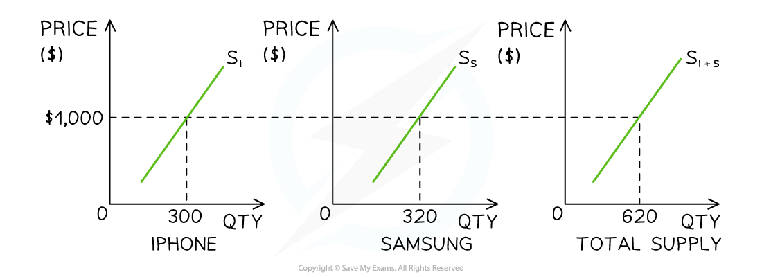
Market supply for smart phones in December is predominantly the combination of iPhone and Samsung supply
Diagram analysis
- In New York City, the market supply for smart phones in December is predominantly the combination of iPhone and Samsung supply
- At a price of $1000, the supply of iPhones is 300 units and the supply of Samsung phones is 320 units
- At a price of $1,000, the market supply of smart phones in New York City during December is 620 units
Movements Along a Supply Curve
Spec point —
2.4.1· A supply curve to be drawn and used to illustrate movements along a supply curve with appropriate terminology, for example extensions and contractions in supply.
-
If price is the only factor that changes (ceteris paribus), there will be a change in the quantity supplied (QS)
- This change is shown by a movement along the supply curve
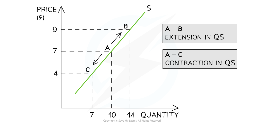
A supply curve showing an extension in quantity supplied (QS) as prices increase and a contraction in quantity supplied (QS) as prices decrease
Diagram analysis
-
An increase in price from £7 to £9 leads to a movement up the supply curve from point A to B
- Due to the increase in price, the quantity supplied has increased from 10 to 14 units
- This movement is called an extension in QS
-
A decrease in price from £7 to £4 leads to a movement down the supply curve from point A to C
- Due to the decrease in price, the quantity supplied has decreased from 10 to 7 units
- This movement is called a contraction in QS
Was this revision note helpful?
Build on this topic