Lines of Best Fit (Cambridge International IGCSE Maths)
Line of Best Fit
What is a line of best fit?
-
If a scatter graph suggests that there is a positive or negative correlation
-
a line of best fit can be drawn on the scatter graph
- This can then be used to make predictions
-
How do I find the coordinates of the mean point?
-
You need to be able to find the mean point, to draw a line of best fit
- Calculate the mean of the x values for all data points, this is
- Calculate the mean of the y values for all data points, this is
-
The line of best fit must pass through the mean point
How do I draw a line of best fit?
-
To draw a line of best fit:
-
Find the coordinates of the mean point,
-
Plot the mean point on the graph with all of the other data values
-
Draw a single-ruled straight line through the mean point
- It must extend across the full data set
- Adjust the angle of the line to try and get roughly the same number of data points on either side of the line along its whole length
-
-
If there is one extreme value (outlier) that does not fit the general pattern
- then ignore this point when drawing a line of best fit
How do I use a line of best fit?
-
Once the line of best fit is drawn, you can use it to predict values
-
E.g. to estimate y when x = 5
- Use the line to read off the y value when x is 5
-
-
It is best to use your line to predict values that lie within the region covered by the data points
- This is called interpolation
-
Be careful: if you extend your line too far away from the data points and try to predict values, those parts of the line are unreliable!
- This is called extrapolation
Exam Hint
- Placing a ruler so that it goes through the mean point and tilting it forwards and backwards can help to find the right position for the line of best fit!
Worked Example Sophie wants to know if the price of a computer is related to the speed of the computer. She tests 8 computers by running the same program on each, measuring how many seconds it takes to finish. Sophie's results are shown in the table below.
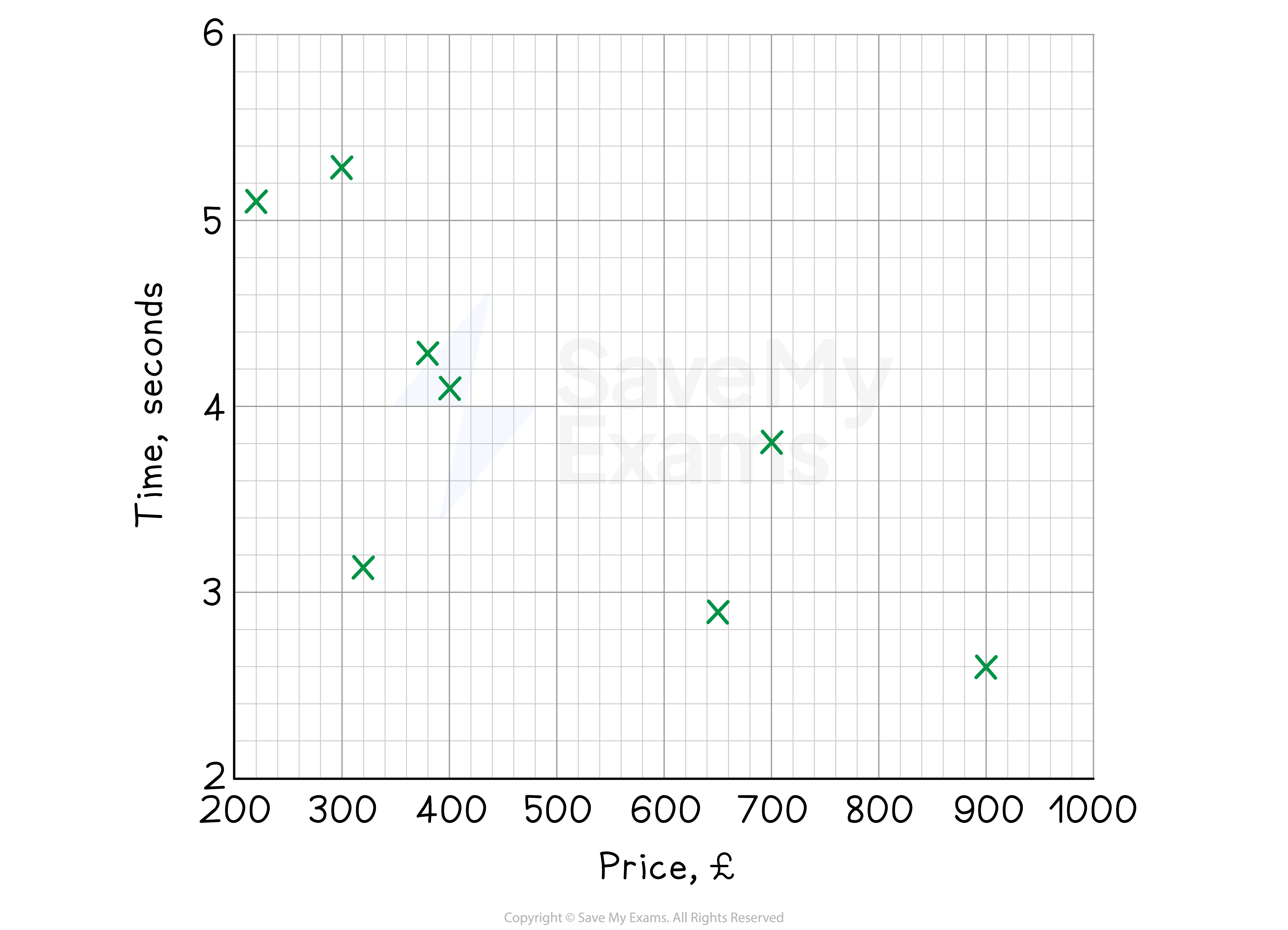
Price (£) 320 300 400 650 250 380 900 700 Time (secs) 3.2 5.4 4.1 2.8 5.1 4.3 2.6 3.7 (a) Draw a scatter diagram, showing the results on the axes below.
Plot each point carefully using crosses
(b) Write down the type of correlation shown and use it to form a suitable conclusion.
The shape formed by the points goes from top left to bottom right (a negative gradient) This is a negative correlation As one quantity increases (price), the other decreases (time)
Final answer: The graph shows a negative correlation This means that the more a computer costs, the quicker it is at running the program
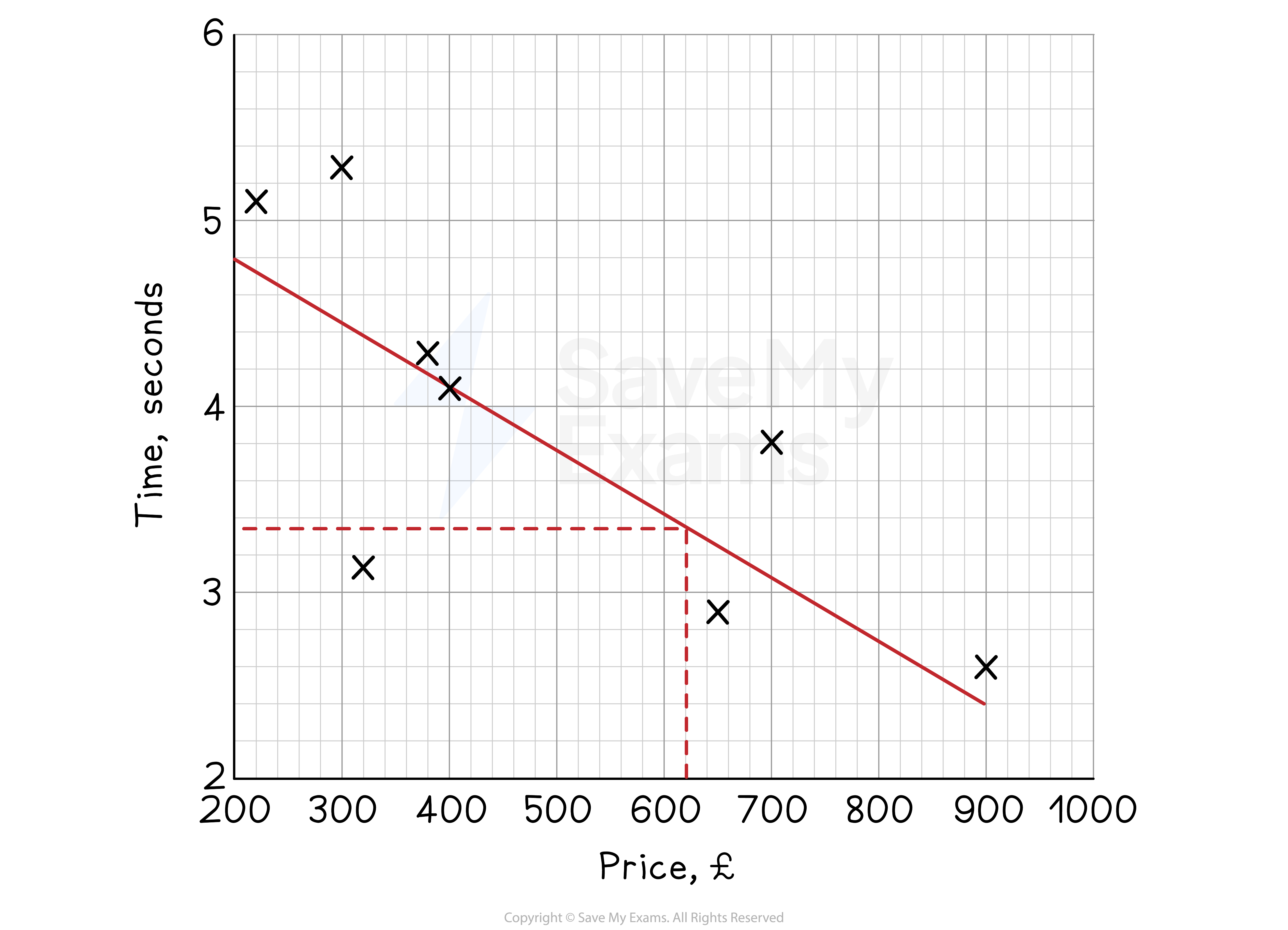
(c) Use a line of best fit to estimate the price of a computer that completes the task in 3.4 seconds.
Find the mean point,
Plot on the graph Draw a line of best fit that goes through it
Then draw a horizontal line from 3.4 seconds to the line of best fit Draw a vertical line down to read off the price
Final answer: A computer that takes 3.4 seconds to run the program should cost around £620
Was this revision note helpful?